
The Nivora brand kit
The whole identity, in the open: logos, colour, type, photography, voice and the prompts behind our images. Copy or download anything with one click.
The mark.
The arrow rising through the wordmark is our symbol of growth. White on dark, black on light, and never redrawn.


Primary wordmark
The full Nivora lockup, mark plus wordmark. The default everywhere.
Arrow mark, light
The standalone growth mark for tight spaces, avatars and favicons.
Arrow mark, dark
The mark in black, for light backgrounds and printed material.

App icon
Rounded app/touch icon for mobile, bookmarks and store listings.
A few things to avoid
Keep clear space around the mark equal to the height of the arrow.
Use white on dark, black on light. Nothing in between.
Don’t recolour, rotate, stretch, or add shadows and outlines.
Don’t place the logo on a busy area of a photo. Find calm space.
The apps, and the services.
The app icons for Box and Voice, and the icon for each service. Same rules as the logo: copy or download, never redraw or recolour.
Product apps
Box
The app icon for Box, all your communication in one place.

Voice
The app icon for Voice, speech to text tuned to how you write.
Services
AIOS
One system that runs the whole company.

App Design
Custom apps, designed and built end to end.
Local AI
Private AI, installed on hardware you control.

AI Consulting
Find where AI pays off before you invest.
Near-black, with earth from the landscape.
Layered near-blacks and a grayscale text ladder. Colour appears only in small earthy accents, pulled straight from the photography. Tap any swatch to copy its value.
Surfaces
Layered near-blacks. The deeper the surface, the further back it sits.
Text
A pure grayscale ladder. Contrast carries the hierarchy, never colour.
Earth accents
Lifted straight from the landscape photography. Used sparingly: glows, dots, selection.
Lines
Hairline borders are always white at very low opacity, never a solid grey.
A serif that speaks, a sans that works.
Hedvig Letters Serif carries every headline; Inter handles the reading and the interface; Geist Mono labels the technical bits.
Intelligent systems for ambitious companies.
Hedvig Letters Serif
Display & headings · Regular 400
Intelligent systems for ambitious companies.
Every headline, the giant wordmark, and the text set over photography.
Inter
Body & interface · Regular 400 · Medium 500 · Semibold 600
We build only what genuinely helps your business.
Paragraphs, navigation, buttons, captions. The workhorse voice.
Geist Mono
Labels & eyebrows · Regular 400
BRAND & MEDIA KIT · 2026
Uppercase mono labels above sections and small technical tags.
One landscape, shot many ways.
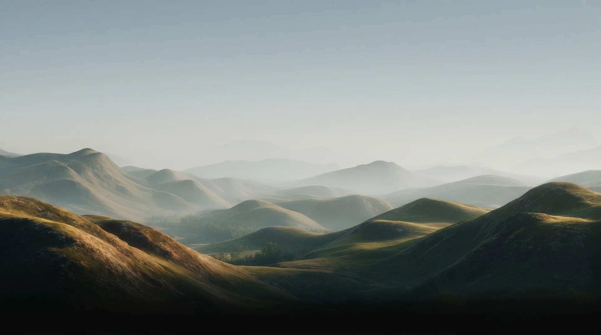
Every Nivora image looks like it came from the same quiet morning. Follow the principles, then use the prompts to make new on-brand photos.



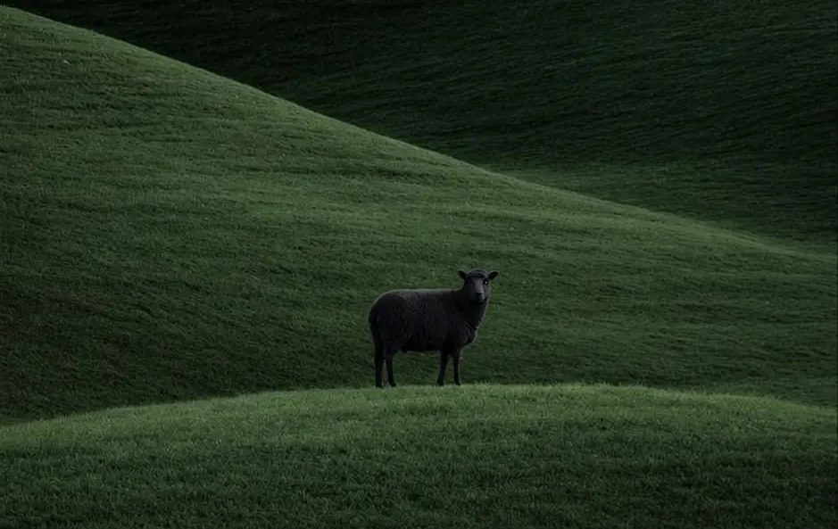
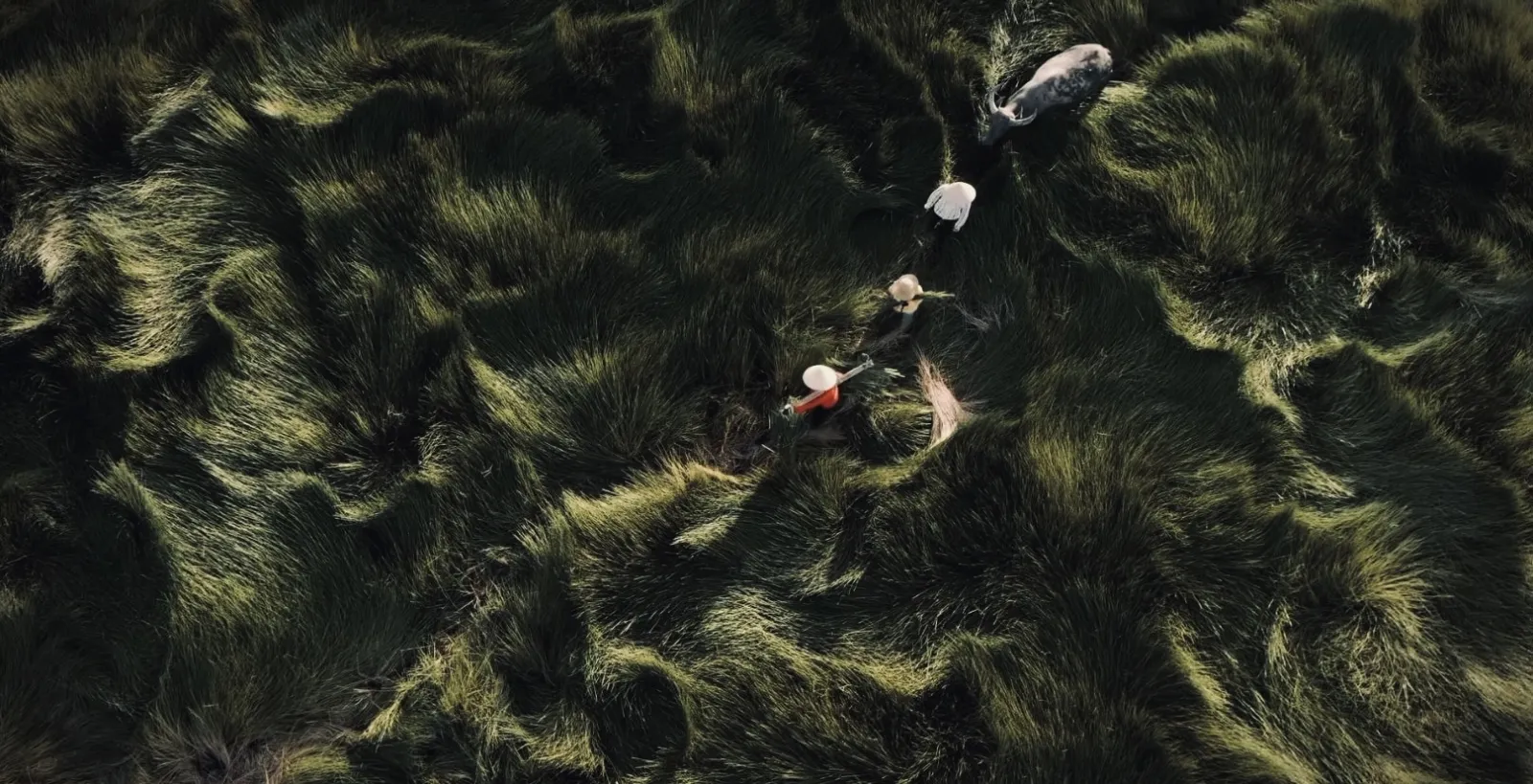
The principles
Cinematic, calm nature: misty mountains, rolling hills, open fields.
Soft hazy light at the top, deep shadow fading to near-black at the bottom.
Strong atmospheric depth of field; distant layers dissolve into fog.
Muted earthy palette: sage & olive green, warm gold, slate blue-grey.
Subtle fine film grain. Never glossy, never saturated, never busy.
When text is added: one short line, centered, in white Hedvig serif.
Image prompts
Paste these into an image model (we use Nano Banana Pro) and swap the capitalised placeholders. They keep every new image on-brand.
Hero / background
Full-bleed section backgrounds and landing heroes.
Cinematic fine-art landscape photograph at dawn: layered rolling green mountain ridges receding into soft morning mist. The upper third is a calm hazy pale blue-grey sky with vast negative space. Strong aerial depth of field, distant ridges dissolving into fog. Low warm golden side-light grazing sage-green slopes; foreground falls into deep shadow and the bottom edge sinks to near-black. Muted earthy palette, subtle fine film grain, painterly, editorial, no people, no buildings, no text.
Blog cover (with label)
Article covers and social cards with a short headline.
Moody cinematic nature photograph, soft atmospheric haze and shallow depth of field, muted sage and gold earth tones, fine film grain, dark vignette. Centered on the image, one short line of large white Hedvig Letters serif text reading "YOUR LABEL". Calm, editorial, minimal. No other text, no logos, no people.
Square ad
Instagram / paid social with stacked copy.
Square cinematic landscape photograph, foggy rolling hills at golden hour, muted earthy palette, fine film grain, deep shadows toward the edges for text legibility. Three centered lines of clean white Hedvig serif text reading "LINE ONE" / "LINE TWO" / "LINE THREE". Spell every word correctly. Serene, premium, minimal. No logos, no people.
How Nivora sounds.
“Calm confidence. We say less, and mean it.”
- Speak plainly: short sentences, concrete nouns.
- Lead with the value, not the technology.
- Be honest about what AI should and should not do.
- Keep restraint: white space, few words, one idea per screen.
- No hype words: "revolutionary", "game-changing", "cutting-edge".
- No bright, saturated colour or neon gradients.
- No stock-photo people pointing at screens.
- Never stretch, recolour or add effects to the logo.
Sharing Nivora? Here is how.
Posting through the affiliate program? Here is what makes a good post, where to share it, and the assets to build from.
What to post
- Show a real problem, then Box or Voice quietly solving it. A genuine moment beats any feature list.
- Keep the tone calm and honest. No hype, no countdowns, no invented numbers or made-up results.
- Always include your personal link, so every signup is tied to you.
- Build from the assets above. Use the logo as it is, never redraw or recolour it.
Where to post
Post wherever your people already are, or simply tell them directly.
Building something with Nivora?
Grab the full bundle, or reach out if you need a format, colour or logo variant that isn’t here.